Your data.

Every level.

Every level of your structure gets the same analytical depth.

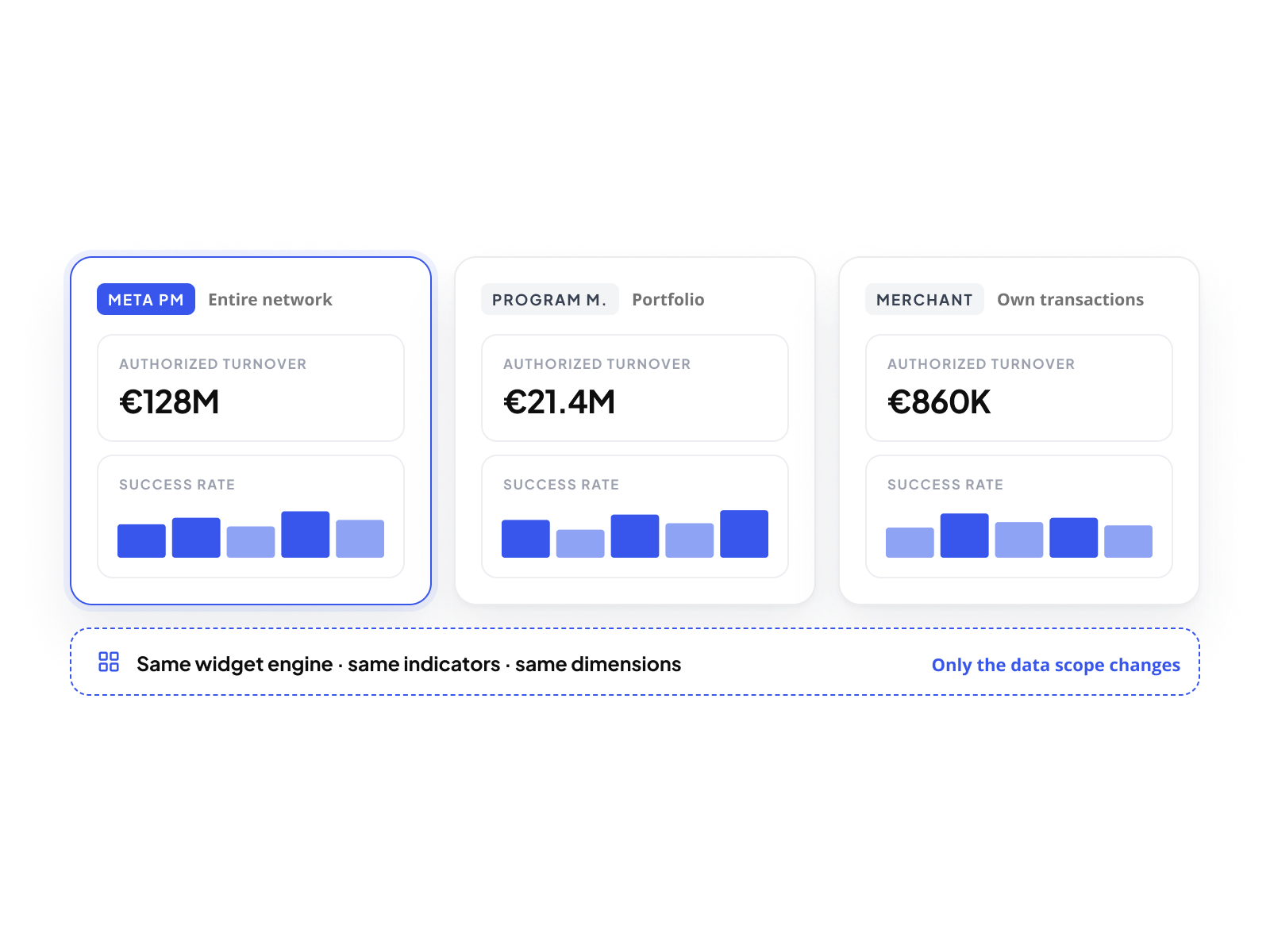
From your own operator view down to each Merchant Account, the same composable dashboards and consolidated overview are available at every scope. Your MPMs track network-wide performance. Your Program Managers monitor their portfolio. Your merchants analyze their own transactions.  Same tool. Same capabilities. The perimeter adapts. The depth does not.

Book a demo
Hero image

The same depth. Across every level.

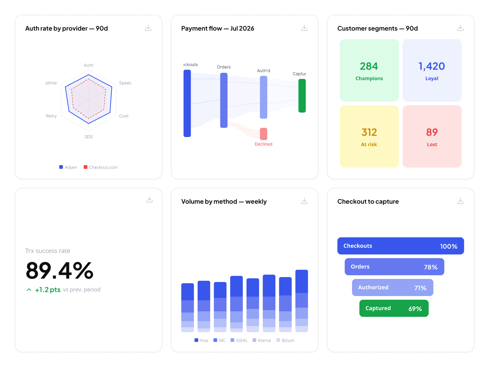
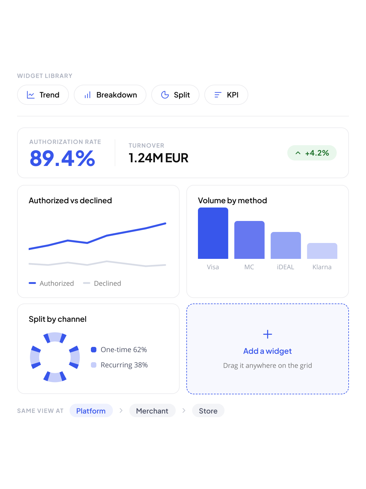
The analytics layer is not tiered. An operator's dashboard uses the same widget engine, the same dimensions, the same indicators as a merchant's dashboard. What changes is the scope of data each level sees. A Meta Program Manager visualizes performance across their entire network. A Program Manager sees their portfolio. A Merchant Account sees its own transactions. Same configuration surface. Same composability. Every level builds the view that fits their operational reality.
Every level. Its own view.
Every authorization, capture, refund, and credit sent by your payment providers is consolidated in Payment Partner, in one normalized view. Each notification carries its amount, currency, and merchant account, so your merchants work at store level and filter by store, date, amount, and status. Multi-provider: whether a merchant runs Adyen in France and Verifone as backup in other markets, every notification lands in the same view.
Shared filters. Consistent context.
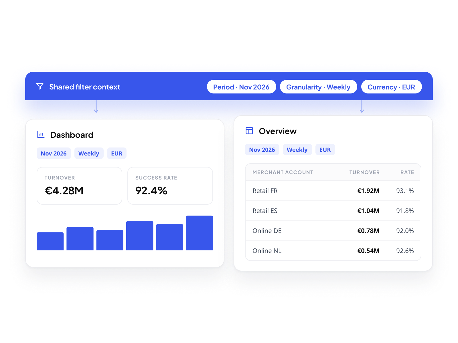
Dashboards and Overview share the same filters: period, granularity, currency. A context set in the dashboard carries over to the Overview automatically. Your teams stop rebuilding the same analytical context in two separate tools.
As many dashboards as their activity requires.
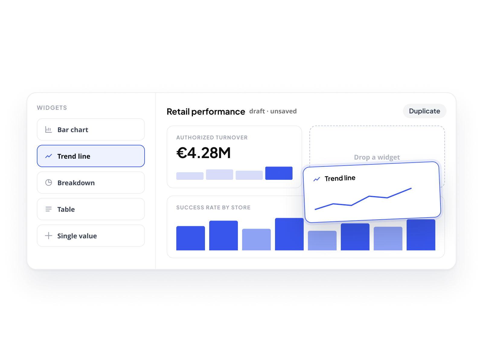
You give every merchant the same canvas. There is no fixed dashboard. Every user builds the views that match their work: one dashboard for authorization performance, another for refund tracking, another for a specific market or payment method. Dashboards can be duplicated, renamed, reordered. Each one is private by default. Shared when it should be.
Build the view. Then rebuild it.
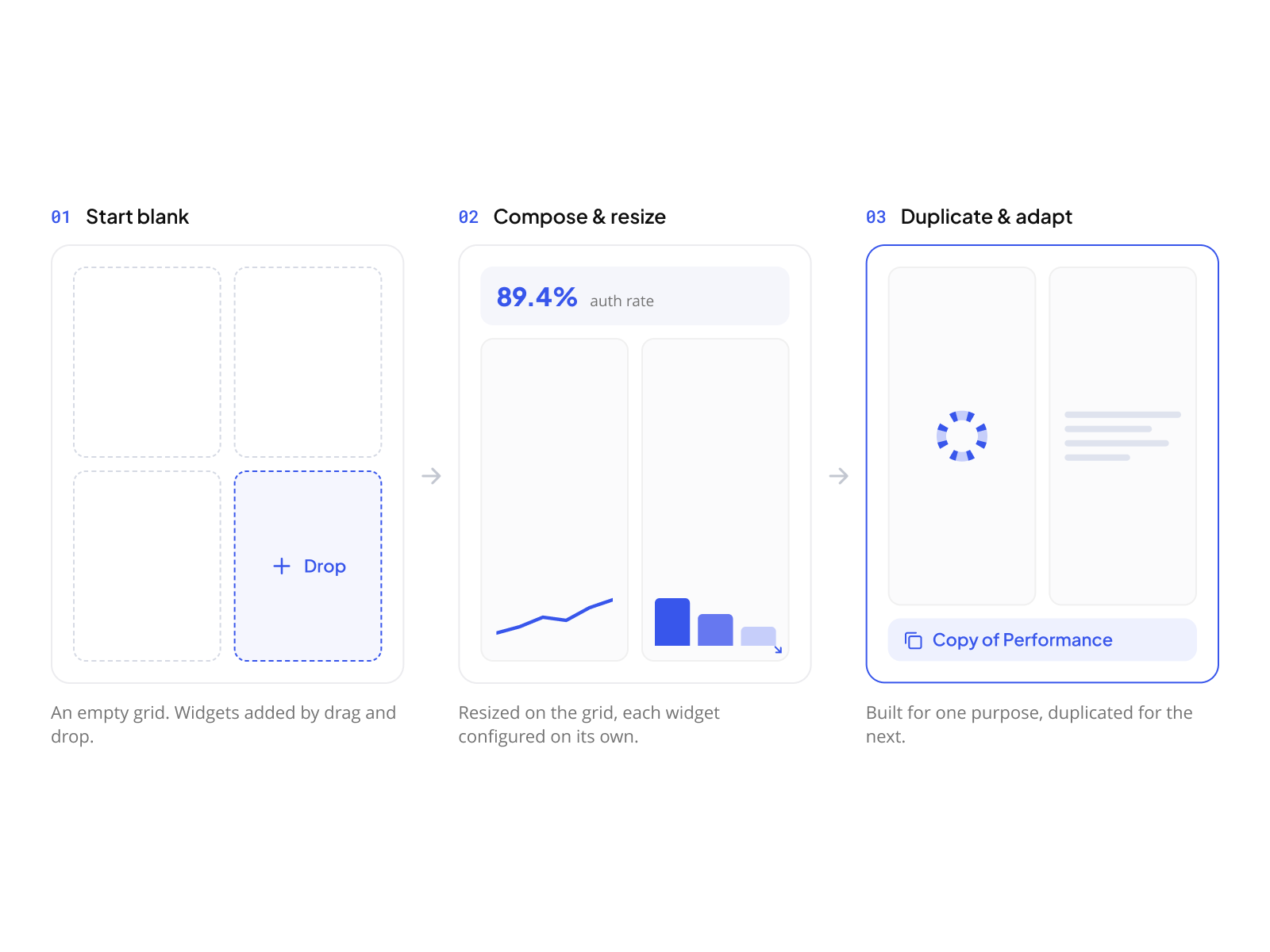
Every dashboard starts blank. Widgets are added by drag and drop, resized on the grid, and configured independently. A dashboard built for one purpose can be duplicated and adapted for another. No configuration is permanent. No layout is locked.
Personal by default. Shared when it matters.
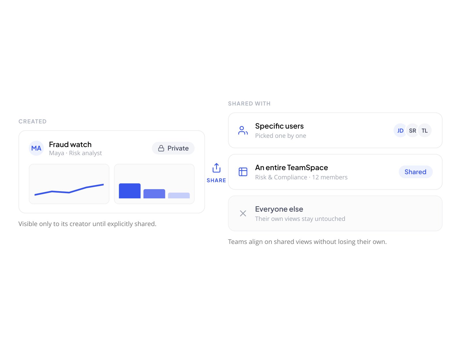
A dashboard is visible only to its creator until explicitly shared. It can be shared with specific users or with an entire TeamSpace. One user's analytical context does not affect another's. Teams align on shared views without losing their own.
The format follows the question.
Every dashboard starts blank. Widgets are added by drag and drop, resized on the grid, and configured independently. A dashboard built for one purpose can be duplicated and adapted for another. No configuration is permanent. No layout is locked.
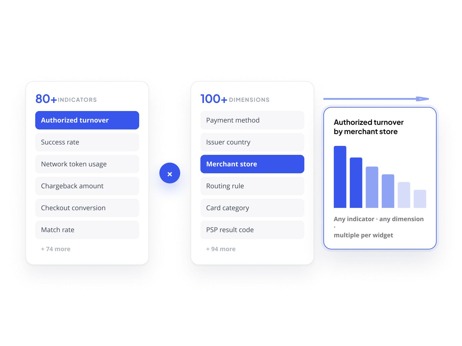
80+ indicators. 100+ dimensions. Every combination valid. 
An indicator defines what is measured: authorized turnover, success rate, network token usage rate, chargeback amount, checkout conversion rate, match rate, frictionless
transaction share, and 70+ more. A dimension defines the axis: payment method, issuer country, routing rule, card category, customer ZIP code, merchant store, PSP result code, and 90+ more. Any indicator can be combined with any dimension. Multiple indicators can coexist on a single widget. The combination determines the answer; the platform does not constrain it.
Every widget is exportable.
Each widget can be exported independently, as an image or as raw data. A dashboard built for internal analysis becomes a slide in a board presentation, a file sent to a finance team, or a CSV fed into an external model. The analytical work stays in the platform. The output goes wherever it needs to go.
Overview. The full picture.  
Without leaving the Console.
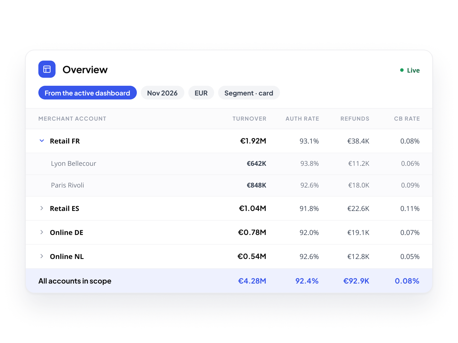
The Overview is not a dashboard. It is a pivot table built into the Console, always available at every scope. At the Meta Program Manager level, it surfaces consolidated performance across the entire network. At the Program Manager level, it covers the portfolio. At the Merchant Account level, it reads the same as a merchant's own view. Same filters as the active dashboard. No export. No rebuild. The data is always there.
Consolidated by default. Filterable by design.
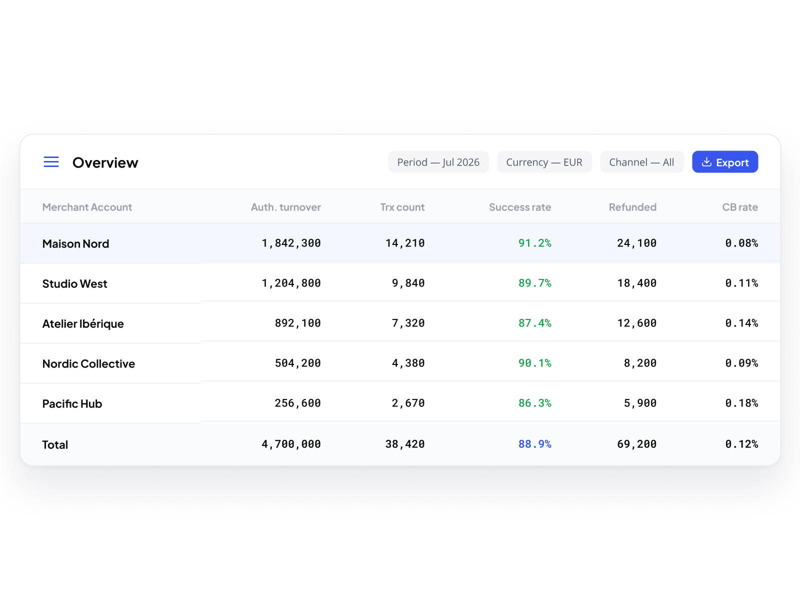
The Overview aggregates every Merchant Account in scope, in a single table. Filter by period, by currency, by data segment. The table updates in real time. Drill into a specific dimension. Export the result. The analytical context set in the dashboard carries over automatically.
One view. Every metric that matters.
Authorized turnover, transaction count, success rate, refund volume, chargeback rate, all visible at a glance, across every Merchant Account in the active scope. No need to open each account separately. No need to reconcile data from multiple tools. The answer is one row per account, one filter away.transaction share, and 70+ more. A dimension defines the axis: payment method, issuer country, routing rule, card category, customer ZIP code, merchant store, PSP result code, and 90+ more. Any indicator can be combined with any dimension. Multiple indicators can coexist on a single widget. The combination determines the answer; the platform does not constrain it.

Your merchants track their performance.
You track everything.

Same tool. Every level. No external BI required.

Book a demo